Observability Course Labs
Kibana Dashboards
Kibana isn't just a great search UI - you can use it for visualizing data too. There's some cross-over here with the functionality of Grafana, which you'll use to visualize metric data. There are two key differences:
- logs give you more detail, typically you can see trends in Grafana which indicate a problem and you'll switch to Kibana to drill down
- logs can give you greater accuracy, you should expect to have 100% of your logs stored, whereas Prometheus only records samples of metrics
Reference
- Building Kibana dashboards
- Managing saved objects
- Features supported by panels - note that some panel visualizations are only available in the commercial version of Kibana
Run the ELK stack and demo apps
We'll start by running the ELK in containers with the now-familiar setup in logging.yml:
docker-compose -f labs/kibana-dashboard/logging.yml up -d
Browse to Kibana at http://localhost:5601, when it's ready then the rest of the logging stack is running.
We'll store structured logs in a new index. In the Kibana Console create an index with custom mapping for the document processor log fields:
PUT /fulfilment-processor
{
  "mappings": {
    "properties": {
      "LogLevel": {"type": "keyword"},
      "MachineName": {"type": "keyword"},
      "EventType": {"type": "keyword"},
      "RequestId": {"type": "integer"},
      "Duration": {"type": "integer"},
      "SourceContext": {"type": "keyword"},
      "AppVersion": {"type": "keyword"}
    }
  }
}
This index will be populated from the same fulfilment-json-to-es.conf pipeline. Logstash is already set up and running, so start the demo app to generate the logs:
docker-compose -f labs/kibana-dashboard/app.yml up -d
Back in Kibana add an index pattern for the new fulfilment-processor index and check the documents in the Discover tab.
The demo app is configured to produce fewer logs, so we can leave it running for these exercises and work with a continuous stream of data.
Creating visualizations
Kibana visualizations work with aggregation queries, using two views of the data:
- buckets - are the field(s) you want to group by, e.g to split documents by the log level or event type
- metrics - are the aggregation(s) you want to calculate over the bucket groups, e.g. the count of documents or the average of a field value
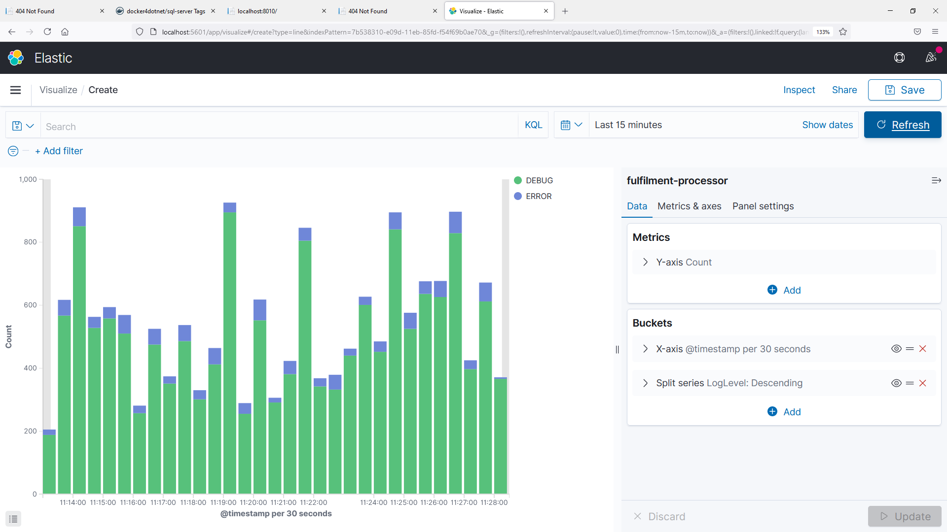
We'll walk through a simple example to show a count of log levels like this:
In the main menu select Visualize...Create New Visualization
-
Choose the Area type and then your
fulfilment-processorindex pattern -
Add a bucket
- select X-axis
- choose a Date histogram using the
@timestampfield - split count by time range
-
Click Update and you'll see a count of all logs over time
-
Add another bucket
- choose Split series to create a sub-aggregation
- select Terms using the
LogLevelfield
-
Click Update and you'll see two lines, showing counts for each log level
📋 Update the visualization settings, switching to a stacked bar graph.
Need some help?
Switch to the Metrics & axes tab and change the Chart Type to Bar for the metrics.
Save your visualization and give it a meaningful name
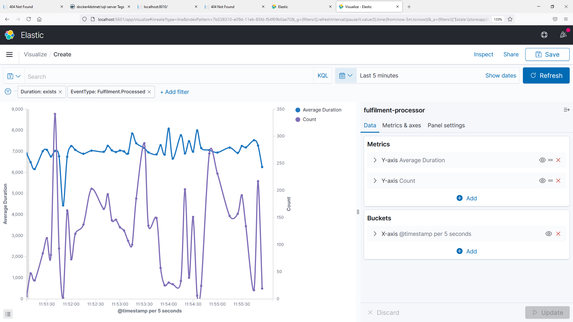
We'll create one more visualization to show the average number of documents being processed, and the average processing time - something like this:
📋 Create a line graph for this visualization, using two metrics - an average of the duration field, and a count of matching documents.
Need some help?
Start with a new Line visualization for your index pattern.
There's no grouping here, so we don't need sub-aggregations - create an X-axis bucket using a date histogram over the timestamp field.
Click Update and you'll see the count of documents over time - but we can filter this with EventType: Fulfilment.Processed so we only include logs that record a processed event.
Then add another metric - a second Y-axis, aggregating an average over the Duration field. Update and you'll see the second line, but the number ranges are very different so the graph is hard to read.
In the Metrics & axes panel, open the Average Duration metric and change the Value axis dropdown, selecting New axis. Click Update and you'll see more useful lines.
You can tweak the order of the axes and the line modes if you want to exactly match my graph.
Save this visualization too
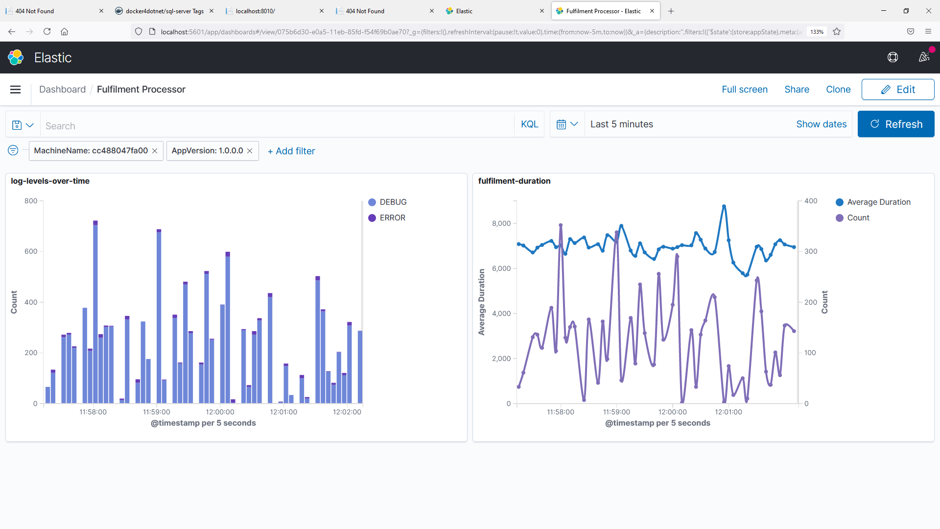
Kibana dashboards are built from visualizations, so now we have some saved we can put them into a dashboard.
Building dashboards
From the main menu select Dashboard...Create dashboard.
📋 Add your existing visualizations to the dashboard.
Need some help?
Click Add an existing in the dashboard panel and select your logs-over-time area graph.
Then click Add in the top menu and select your processing time line graph.
You can add filters and change the time frame - that alters the underlying dataset for the dashboard, so all the visualizations will update to use the same data:
You can create new visualizations for the dashboard from the + Create new button in the top menu.
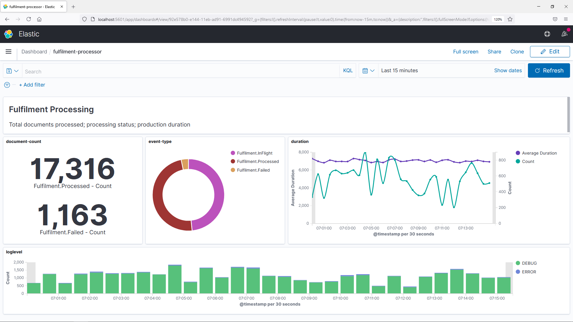
📋 Add some more visualizations to build up a more complete dashboard for the document processor:
-
a Metric view showing the total number of documents created, and the total number which failed processing
-
a Pie chart showing the breakdown of event types for the logs
-
a Markdown showing a title and description of the dashboard data.
Need some help?
The Metric visualization just needs a count, split into buckets by EventType. You can filter out InFlight status to show only completed and failed processing.
The Pie visualization will need the metric sliced by count, and the bucket will split slices by EventType.
The Markdown visualization can have any markdown text, in my dashboard I use this:
## Fulfilment Processing

Total documents processed; processing status; production duration
You can rearrange and resize all your visualizations - the final dashboard might look like this:
Save your dashboard when you're happy with it.
Lab
Saved objects in Kibana can be exported to JSON, so you can load them into another Kibana instance.
Save your dashboard and then confirm you can import it again by resetting the Kibana data store.
You'll get errors once you've done that, so you'll need to restart the Kibana container before you can import your dashboard:
docker restart obsfun_kibana_1
Cleanup
Cleanup by removing all containers:
docker rm -f $(docker ps -aq)